
Inside a Metairie Kitchen Renovation: Reimagining a French Colonial Revival for a Family of Five
A kitchen, breakfast nook, and butler's pantry transformation in Old Metairie — and every source we used to bring it to life.
The House
The home is a classic Metairie French Colonial Revival — a beloved Louisiana suburban architectural style that took hold here in the 1960s and 70s as a love letter to the French plantation homes upriver. Two stories of warm brick. Symmetrical galleries on both floors. Slender white columns. Dark green louvered shutters flanking floor-to-ceiling French doors. The kind of house that feels like it has always been here.
The family of five had already fallen for the bones. What they needed was an interior that matched the way they actually lived — three kids, constant cooking, frequent entertaining, and a back of the house that needed to feel like one continuous, livable moment instead of three small disconnected rooms.
The wife came to us first. She knew her pain points — the cramped dining shuffle, the missed storage opportunities, a layout that wasn't earning its square footage — but she couldn't quite see the path to the kitchen she wanted. That's our favorite kind of client conversation. She knew what wasn't working. We helped her see what could.
This post is the story of how we got there, what we chose, and why. Every product we used is linked to our ShopMy collection at the bottom — including the Thermador appliance package, the West Elm lighting that anchors the whole kitchen, and the Champagne Bronze fixtures that thread through every surface.
The Before
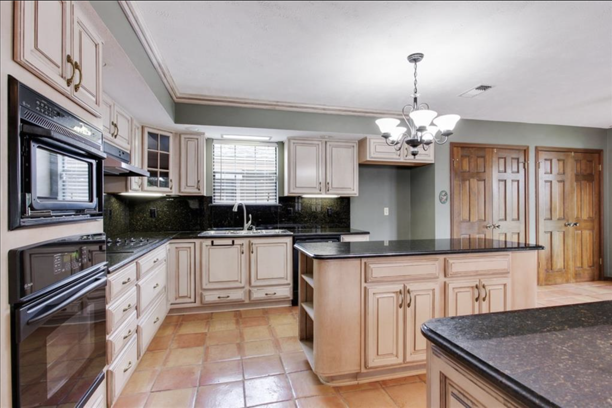
The kitchen before — pickled raised-panel cabinetry, dark green granite, double black wall ovens, and Saltillo tile underfoot. A thoughtful renovation in its day, just not built for the way this family wanted to live now.
The original kitchen had been beautifully maintained — raised-panel cabinetry, dark green granite counters and backsplash, double black wall ovens, and a generous Saltillo tile floor that ran throughout the back of the house. It was thoughtful work for its era. But the layout broke the cooking, eating, and gathering zones into separate rooms, and the dropped soffits made the space feel lower than it actually was.
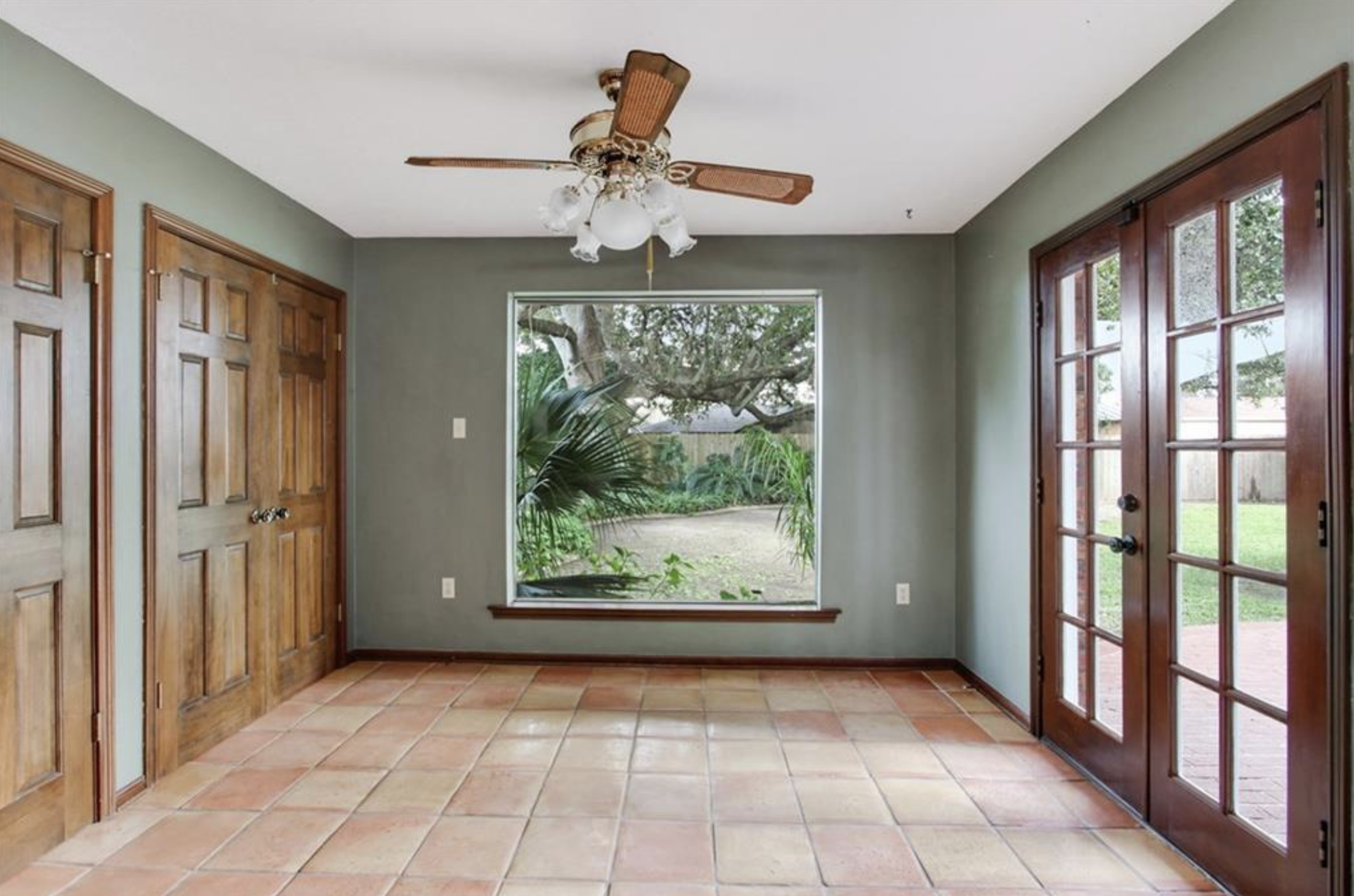
The breakfast nook before — sage walls, more Saltillo tile, a flat ceiling, and the picture window that would eventually become the heart of the new design.
The breakfast nook had two things going for it: that picture window framing a magnificent live oak in the back yard, and a roof pitch directly above that no one had ever exposed.
It also had a charming-but-impractical quirk: the back of the house had four operational doors to the yard. Lovely in theory. Too much in practice. One of those doors was about to become something else entirely.
The Conversation
Every renovation starts with a conversation about what everyone actually wants. On this project:
The client wanted an arch. A real architectural moment in the kitchen.
The husband wanted a bar area. Somewhere to make a cocktail without feeling like he was in the way.
I wanted clean counters, real organization, and a flow that worked at full speed on any given weeknight.
A renovation is always a dance between budget and desire. You won't get every single thing on every single list. But when you can deliver each person's most important thing — and have them genuinely want the trade-offs — that's when a project clicks. Everyone got their non-negotiable. Nobody had to give up the thing they cared about most.
The Plan
We approached this as one connected project, not three separate rooms. The brief came down to four moves:
Strategic gut of the kitchen — rebuilt around a working family of five, with a much larger single-level island, a serious cooking setup, and integrated refrigeration.
Reclaim one of the four back doors as a window — and add new cabinetry where the door used to be. Same charm, more function.
Vault the breakfast nook ceiling — follow the existing roof pitch and finally give the room the lift it deserved.
Pull out the Saltillo and the changing stone floors throughout the first floor, and replace everything with new wide-plank red oak so the kitchen, dining, library, and entry would all flow as one room.
Project length: roughly four months from demo to final walk-through.
The Kitchen
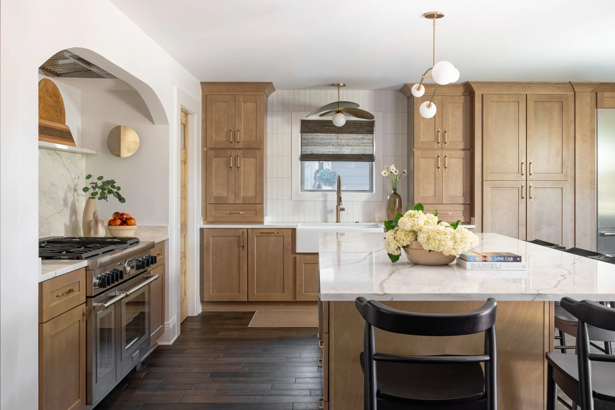
The new kitchen — warm-stained custom oak cabinetry, a single-level quartz island, integrated paneled refrigeration, and the brass orb chandelier from West Elm overhead.
We rebuilt the kitchen around a single oversized island in warm-stained custom oak, topped with a quartz that reads as marble in person — Vicostone Misterio Gold. One level. No raised bar tier. I love an island where the whole family — and their soccer teams — can gather around the same plane. A two-tier island separates people; a single-level island brings them in.
Cabinet selection on this project was one of the hardest decisions we made. Cabinet pricing varies wildly, and the difference between "fine" and "right" is a number that can scare you. We ran the math carefully and landed on these natural-wood shaker cabinets — a finish we vetted hard for longevity, knowing it had to look as good in fifteen years as it did the day it went in. The warm stain plays beautifully against the new dark wide-plank oak floors and brightens the entire room.
The hardware throughout is Champagne Bronze from Goo-Ki — three-inch knobs and five-inch bar pulls — and that finish reappears on the plumbing, the lighting, and the cabinet hinges. Committing to one metal across an entire space is one of the cheapest design moves you can make and one of the most consequential. Mixing finishes can absolutely work, but only when it's deliberate. On this kitchen, I wanted the brass to read as a single thread.
The walls throughout the kitchen, breakfast nook, and butler's pantry are Sherwin-Williams Natural White SW9542 — eggshell on the walls, semi-gloss on the trim, flat on the ceiling, and eggshell again inside the range alcove. We chose a single warm white as the canvas for the entire downstairs. It lets the wood, the stone, and the brass do the talking.
For appliances, the family went all-in on a Thermador package: a 48-inch professional gas range with cobalt blue knobs, a 48-inch French door integrated refrigerator, an additional 24-inch refrigerator drawer, an integrated microwave drawer in the island, a fully integrated dishwasher, and a 48-inch hood insert. It's a serious cooking kitchen for a family that actually cooks — and the panel-ready integration keeps the wall of cabinetry visually clean.
A Hot Take on Storage
I'll go ahead and say it: uppers are overrated.
They're hard to reach, especially in homes with the tall ceilings most New Orleans houses have. They make a kitchen feel busier than it needs to. And they push everyday items into spaces you have to stretch for — which means the things you use most end up on the counter.
I'd rather see plates in drawers. Glasses too, if the client lets me. (We didn't quite get there on this one, but I'm always going to make the pitch.) Drawers bring everything down to where your hands actually are. Kids can set the table. You can grab three plates without a step stool. The visual weight of the room drops, and suddenly the kitchen breathes.
We walked through every category of thing this family owned — every dish, every appliance, every Tupperware tower — and decided where each one would live before we drew a single cabinet. That kind of pre-design inventory work is unglamorous. It's also what separates a kitchen that looks organized from one that actually stays that way.
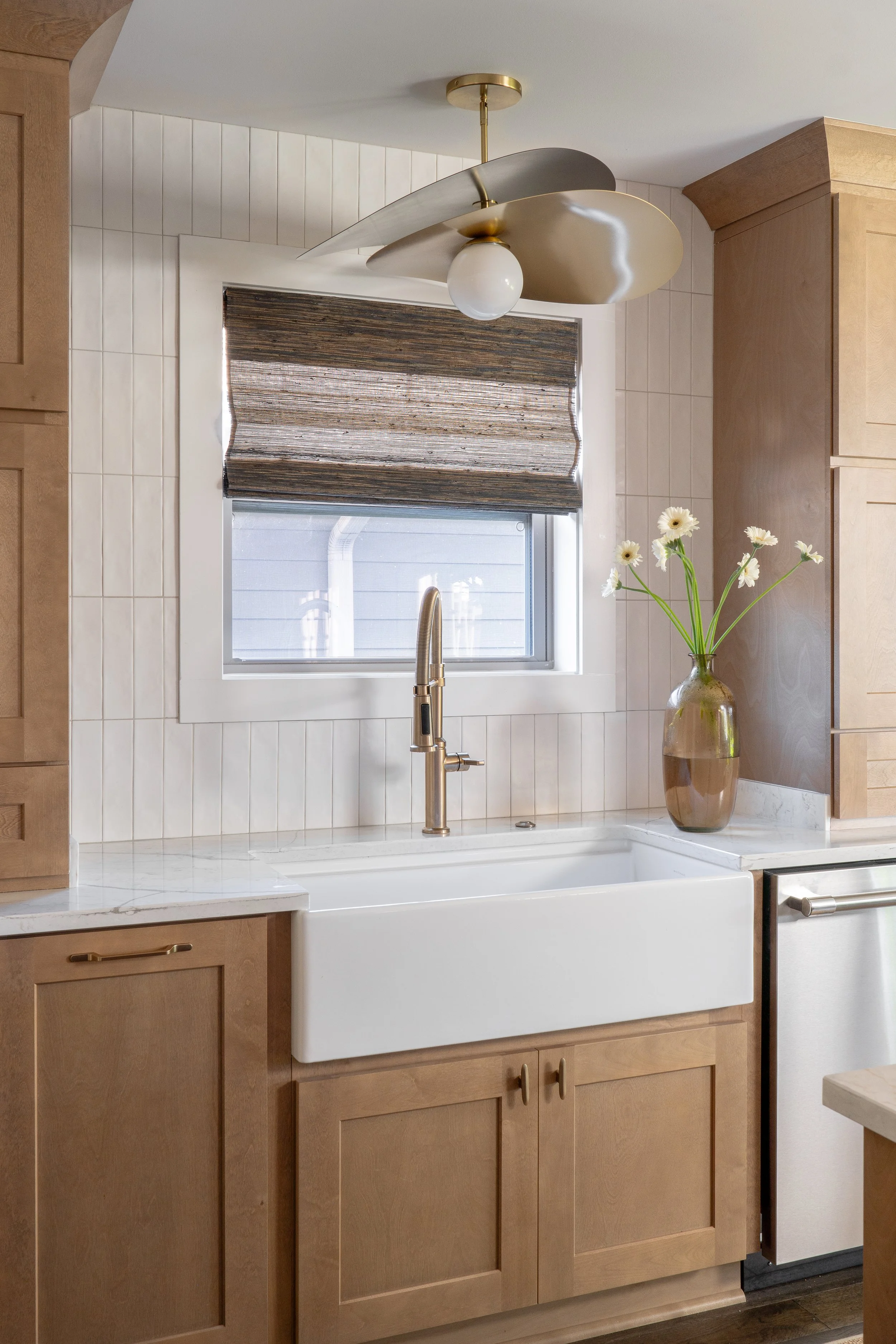
The farmhouse sink moment — vertical stack tile backsplash, brass faucet from Delta in Champagne Bronze, woven Roman shade, sculptural brass petal pendant from West Elm.
The farmhouse sink (a deep 33-inch single-basin) sits under the original window, now updated with a custom woven Roman shade. The faucet is Delta in Champagne Bronze, with a matching air switch for the InSinkErator Pro 750 garbage disposal hidden in the countertop — no chrome button breaking the line.
Above the sink, we hung a sculptural brass petal flush mount from West Elm — the kind of light that becomes architecture in its own right. The backsplash is a vertical stack tile in a warm white. We love stack tile for the way it draws the eye up and gives a classic shape a fresh rhythm.
The Range Alcove
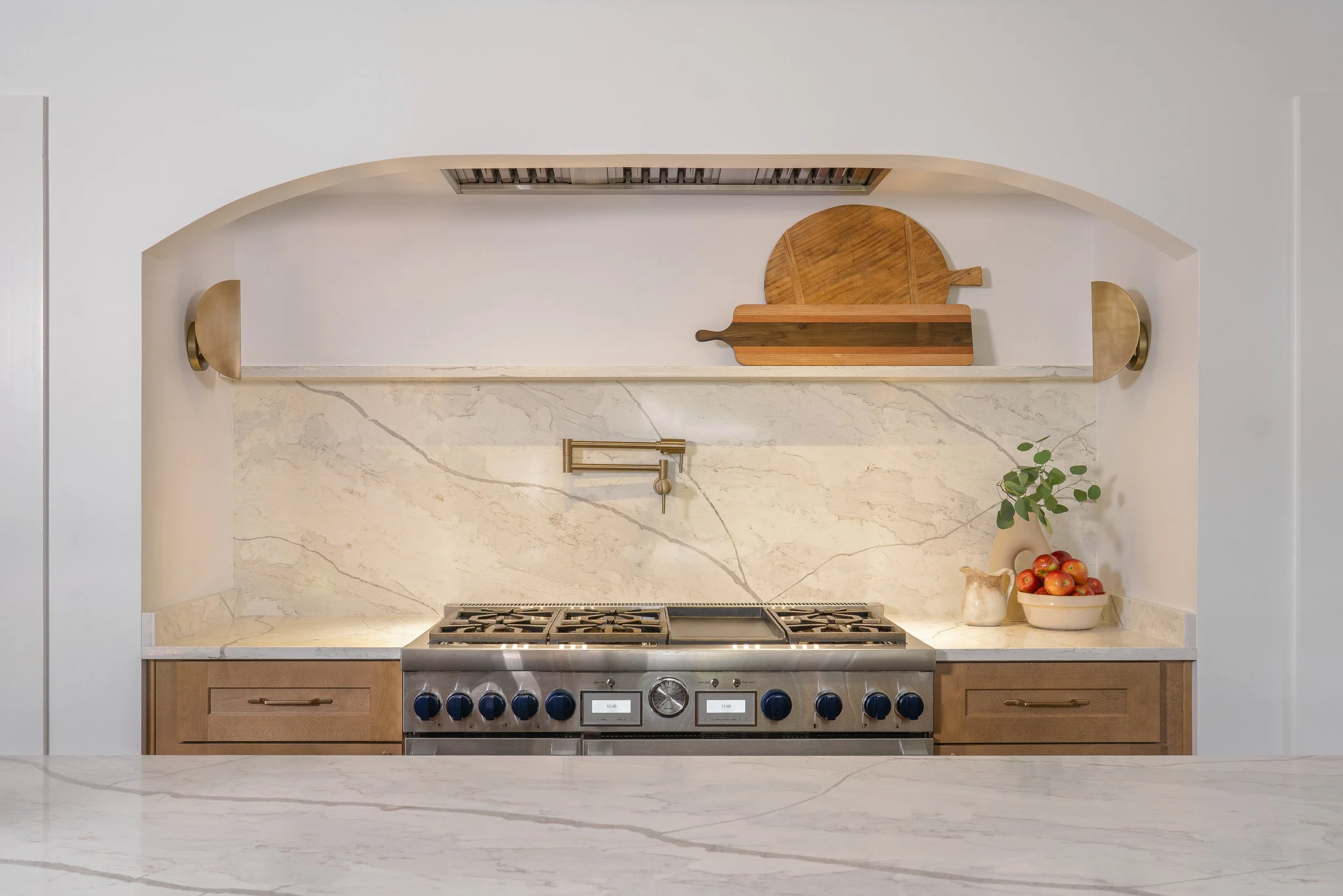
The arched range alcove — full quartz slab backsplash, brass pot filler, brass-bracketed floating shelf, hidden ventilation in the arch above.
The client wanted an arch, and the range nook was the best place for it.
We framed the Thermador 48-inch range inside a curved opening, ran a single full slab of quartz from counter to ceiling as the backsplash, and installed a brass pot filler in Champagne Bronze at perfect arm's reach over the burners. The hood ventilation is hidden in the arch above so nothing competes with the clean look.
A floating quartz shelf bridges the alcove — a place for two beloved bread boards to live as everyday sculpture. Two sconces flank the shelf at the ideal task-light height for nighttime cooking.
The Surprise
Halfway through demo, we found a structural wall that hadn't shown up in any of our pre-construction walk-throughs. There it was, sitting exactly where the refrigerator wanted to go.
Two options: bump the fridge out into the kitchen and lose the clean cabinet line, or eliminate one of the pantry cabinets entirely. Neither was acceptable. So we got creative — reworked the cabinetry around the beam, expanded the kitchen further than the original plan, and ended up with a layout that's actually better than what we drew.
This is the part of renovation that doesn't show up in the inspiration photos. Surprises happen on every job. The question isn't whether you'll hit one — it's whether your team can solve for it without compromising the design intent. M&Z runs design and construction under one roof for exactly this reason. The person who drew the kitchen is the person making the call on the fly.
The Breakfast Nook
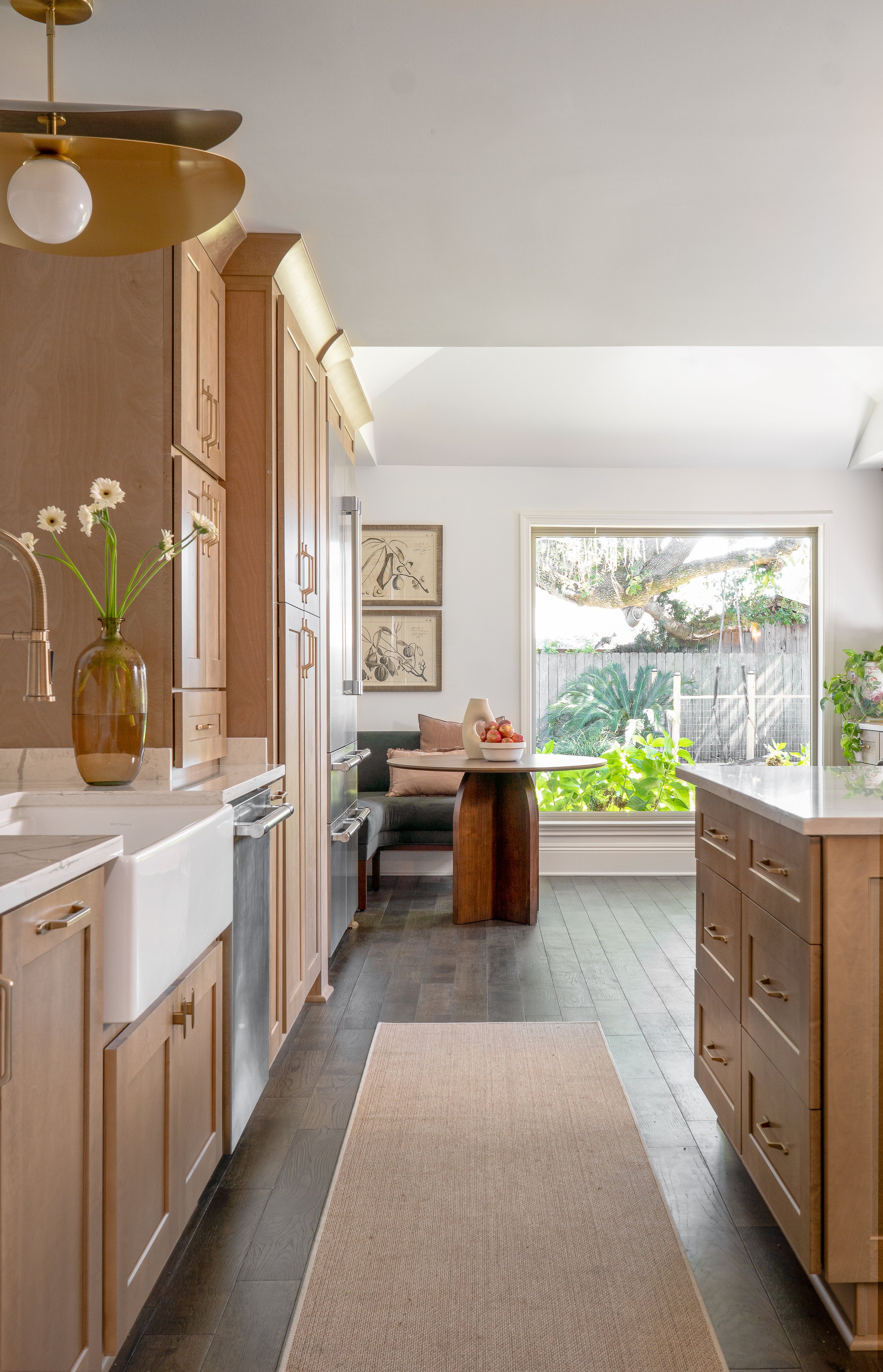
The breakfast nook with the new vaulted ceiling that follows the roof pitch above. The picture window — preserved from the original — frames a magnificent live oak.
The vaulted ceiling wasn't in the original scope. It was the husband's idea.
He'd been looking up at that flat ceiling for years and wondering what was above it. We checked the framing, confirmed the roof pitch could be exposed, and ran the numbers. It was a real moment of "this is going to make the whole back of the house feel different" — and it did.
We took out the flat ceiling, vaulted the nook into a treehouse-like space, and let the picture window do its work. The live oak outside became the room's permanent piece of art.
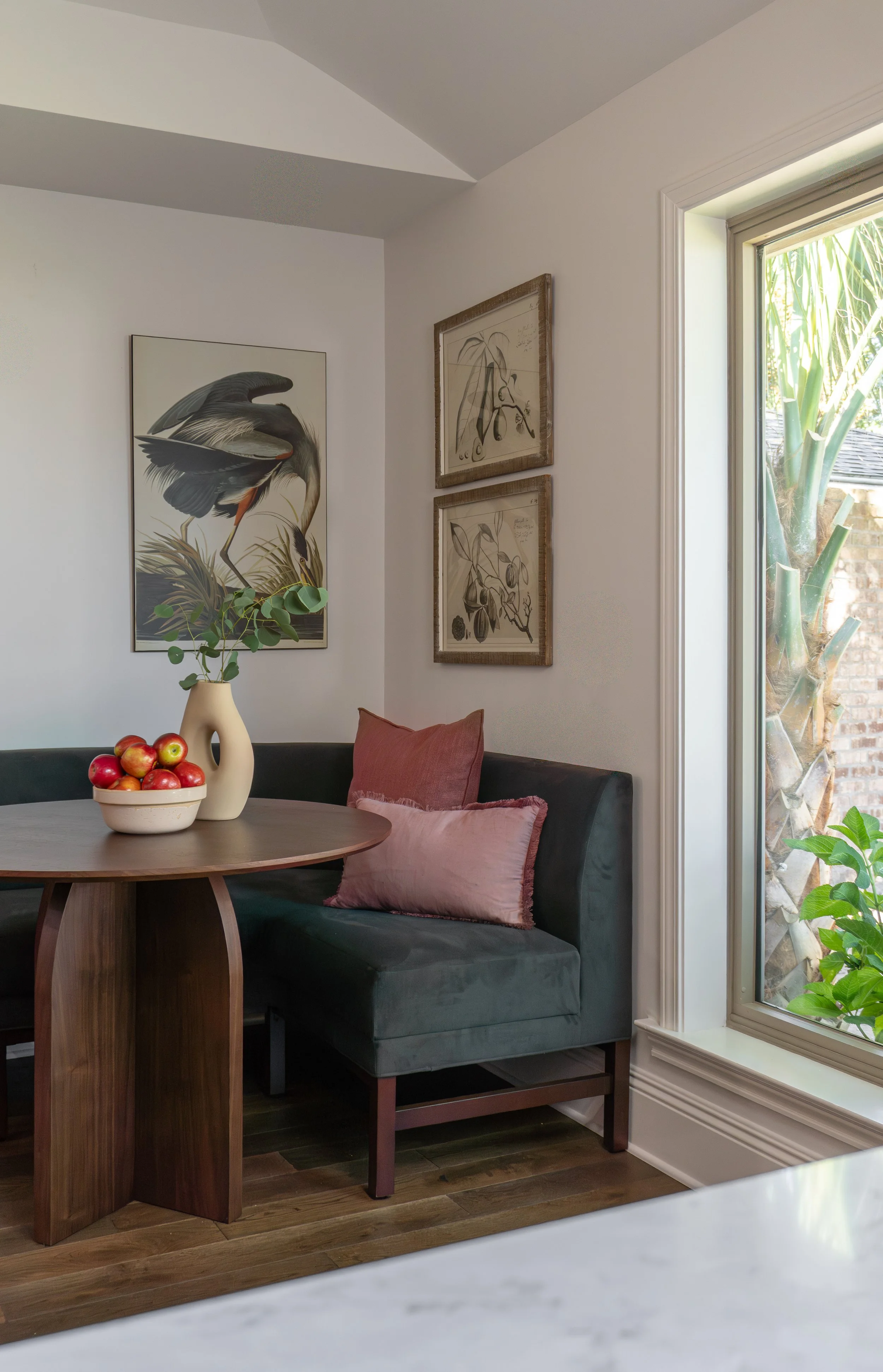
Inside the nook — vaulted ceiling, Audubon heron print, framed botanical sketches, deep teal velvet banquette from Article in Welsh Green.
I'll also confess my other strong opinion here: breakfast nooks with banquette seating beat standard tables in family homes every time. They seat more people in less square footage, kids can slide in and out without pulling chairs, and they create a gathering moment that a four-chair setup simply can't.
We built the seating around a corner banquette, paired with a sculptural walnut pedestal table and warm caramel leather pillows. The wall art leans local: a large Audubon heron print (a nod to the Louisiana wetlands) alongside a pair of antique botanical sketches in distressed wood frames.
It's now the most-requested seat in the house.
The Butler's Pantry
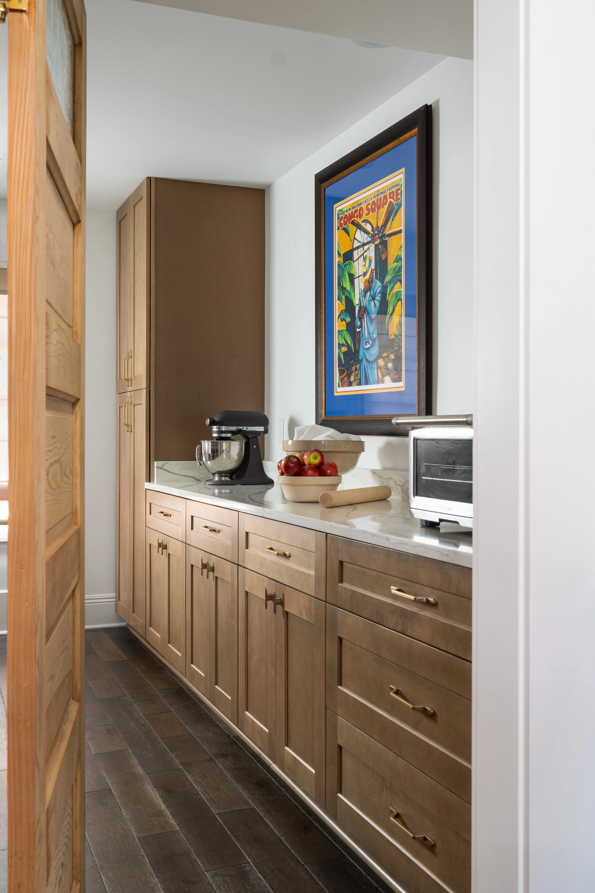
The new butler's pantry — warm-stained oak cabinetry, quartz counter, and a beloved family Jazz Fest "Congo Square" poster as the centerpiece.
I love a pantry. I try to fit a butler's pantry into every project where space and budget allow — they earn their square footage in a way few other rooms do.
When we converted the formal living room into the new dining room, we carved out a butler's pantry between it and the kitchen — a true working pass-through with deep storage, a continuous counter for staging, and room to live with the everyday tools (the mixer, the toaster oven, the rolling pin). My favorite part? The door wings both ways, as if it’s a busy restaurant door.
The best design moments often come from honoring something a client already loves rather than introducing something new — and few pieces of art are as quintessentially New Orleans as Congo Square. The poster makes this room feel more like a sanctuary than a pantry.
The Sources
Every product we used is in our ShopMy collection for the Metairie Kitchen — the easiest way to shop the entire project at once.
A few highlights:
Lighting (all West Elm)
Brass orb chandelier over the island — the sculptural moment
Sculptural petal flush mount over the sink
Pair of brass sconces flanking the range alcove
Appliances (Thermador)
48" Professional Gas Range
48" Integrated French Door Refrigerator
24" Refrigerator Drawer
Integrated Microwave Drawer
Fully Integrated Dishwasher
48" Hood Insert with Hood Blower
Plumbing (Delta in Champagne Bronze)
Main kitchen faucet with pull-down spray
Pot filler at the range
Air switch for disposal
Hardware
Goo-Ki Champagne Bronze knobs and bar pulls
Surfaces
Vicostone Misterio Gold Quartz (counters and backsplash)
Floor & Decor unfinished red oak, select grade (floors throughout the first floor)
Paint (Sherwin-Williams)
Natural White SW9542 — walls, ceiling, trim, and range alcove
Furniture
Article Rosin Corner Banquette in Welsh Green
Coming Next
This kitchen was just one piece of the project. In our next post, we'll walk you through the library transformation — how we reimagined the existing built-ins with a single confident color choice (Sherwin-Williams Sea Mariner SW9640) and turned a forgotten formal room into the most-used space in the house. (Link coming soon.)
Working with M&Z
M&Z combines design and construction under one roof — Margaux on design, Zack on the build. We carry the intent through the entire project, which means fewer translation losses between vision and execution, and a team that can problem-solve when something unexpected shows up behind a wall.
If you have a Metairie or New Orleans home that's ready for its next chapter, we'd love to hear from you.
Shop the entire Metairie kitchen on ShopMy →
Get in touch with M&Z about your project
All photography by @guephotographyco. Some links in this post are affiliate links, which means we may earn a small commission if you purchase through them — at no additional cost to you.